


TOSTOS
TOSTOS is a tortilla chip brand developed for a crowded snack category where many products begin to feel interchangeable. Previously known as Krip Krip Tortilla, the brand struggled to build recognition among younger consumers due to a difficult name, low visibility, and packaging that lacked a clear sense of appeal.
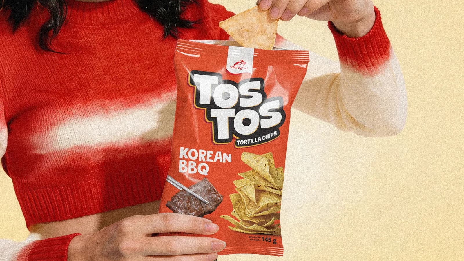
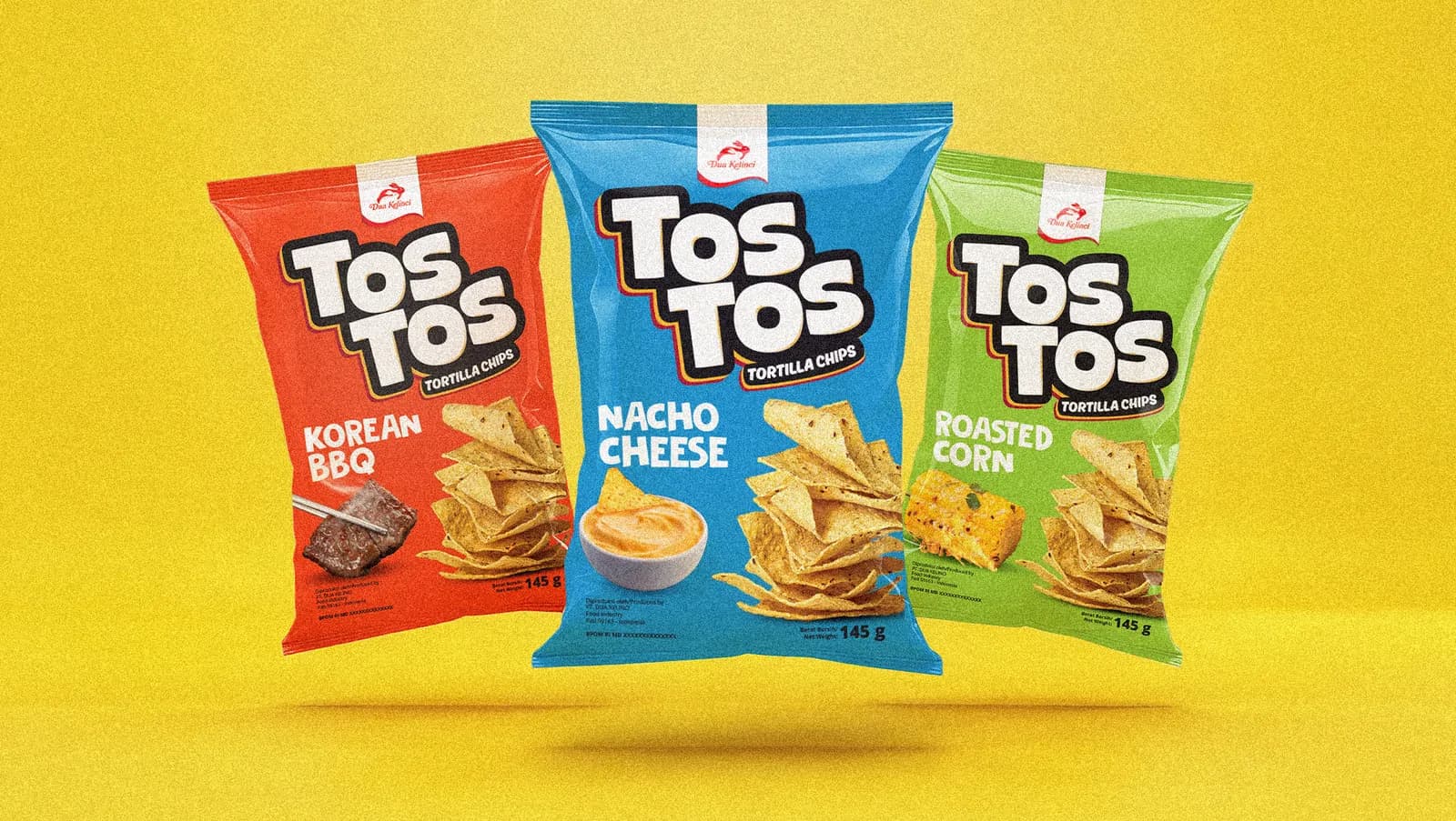
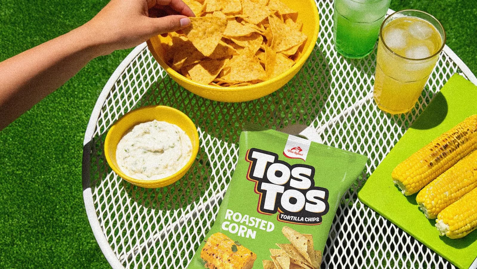
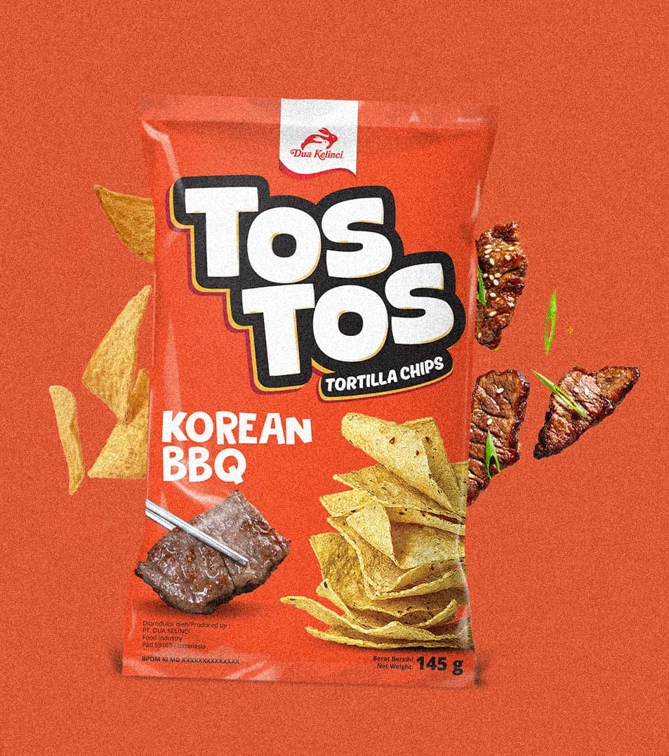
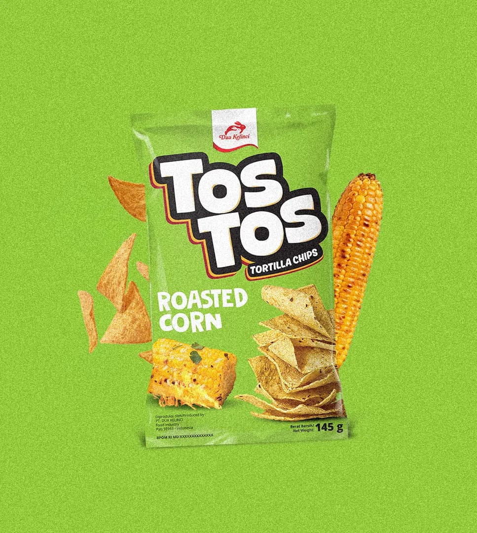
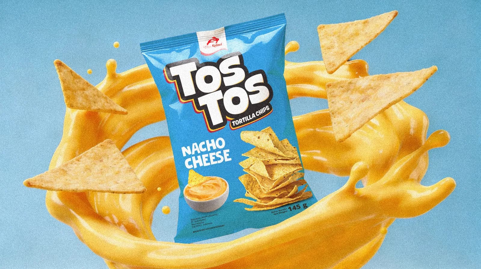
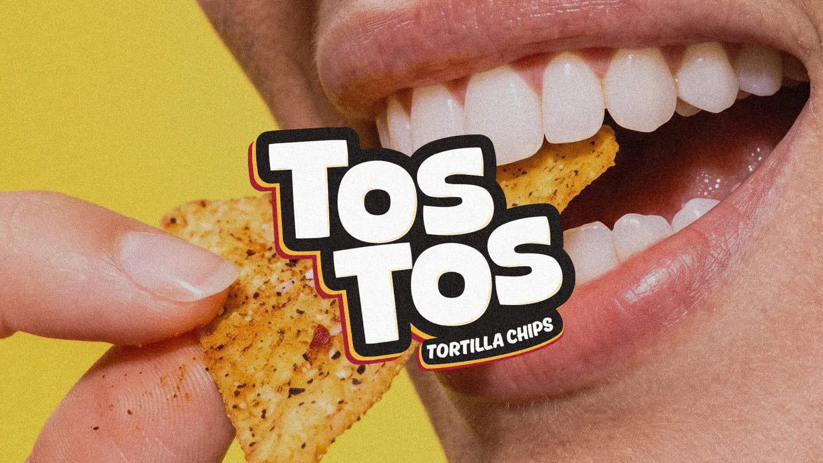
The rebrand repositioned the product from a generic snack into a brand with clearer cultural relevance and stronger shelf presence. The move to TOSTOS introduced a name that is shorter and easier to pronounce. From there, the visual system was designed to match the energy of its audience. A bold and bubly logotype gives the brand a stronger personality, supported by striking color differentiation and direct food imagery that makes each flavor easy to identify.
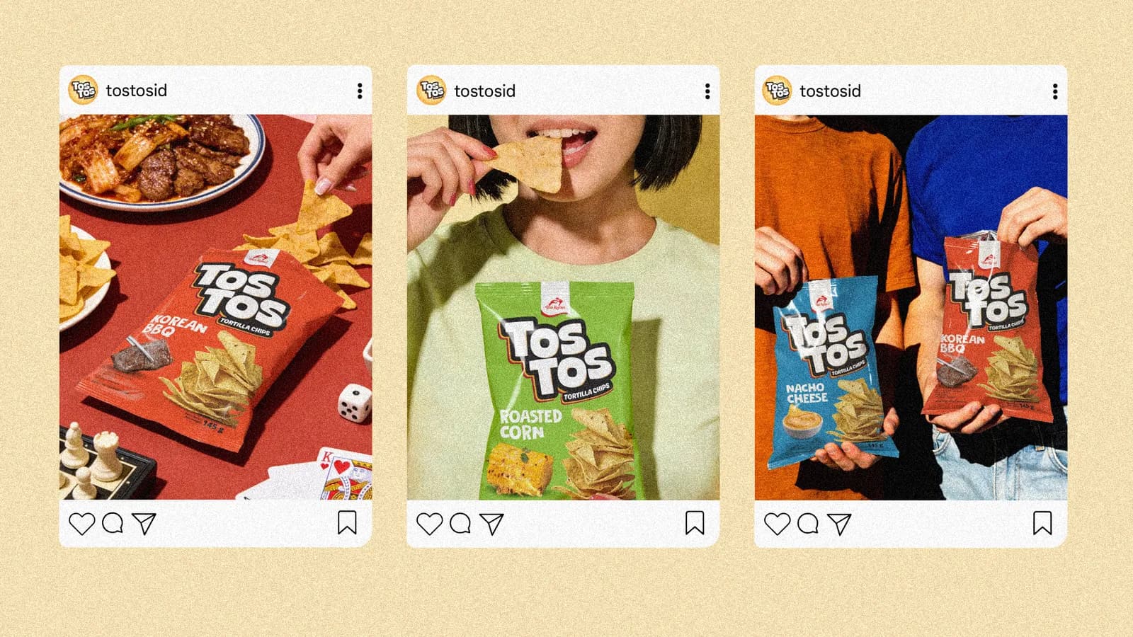
The system extends across packaging and communication materials with a consistent visual language that feels playful and expressive. Rather than relying on exaggerated claims, the identity focuses on clarity, appetite appeal, and a stronger connection with young everyday consumers.
Year
2022
Scope
Packaging Design
Brand Identity Development
Industry
Consumer Goods
Creative Lead
Johan Wiraatmaja
Creative Team
Alex
Ario


